

Case Study: Paws Paradise of Boardman – Admin Dashboard
Redesigned the Paws Paradise Management Software into a modern, user-friendly platform that streamlined bookings, pet profiles, and emergency contact management, resulting in improved operational efficiency and user satisfaction.
Client Research
Before starting the project, we held an initial Zoom meeting with the Paws Paradise of Boardman team and the clients, Kim and Scott McCuskey, the owners and founders of Paws Paradise of Boardman. During the session, we explored their current pain points with the existing software used for managing bookings for lodging, day care, and grooming services. This conversation helped us understand their operational challenges and set a clear direction for the dashboard redesign.
Heuristic Evaluation
To better understand the platform’s usability issues, our team conducted a hands-on heuristic evaluation, approaching the experience as first-time users. This helped us identify key usability barriers from a fresh perspective.
Key findings included:
- Outdated Interface: The system’s design felt antiquated, leading to confusing navigation and a frustrating user experience overall.
- Redundant and Missing Features: Several existing tools were obsolete, while essential modern features—such as intuitive booking flows and automation—were completely absent.
- Lack of Customization: The client requested support for bundled packages and custom discount options. Unfortunately, the platform’s rigid architecture offered no flexibility for implementing tailored services or promotional strategies.
User Stories
During our discovery phase, the client identified four key red routes—high-priority tasks essential to daily operations. These informed the core functionality of the redesign:
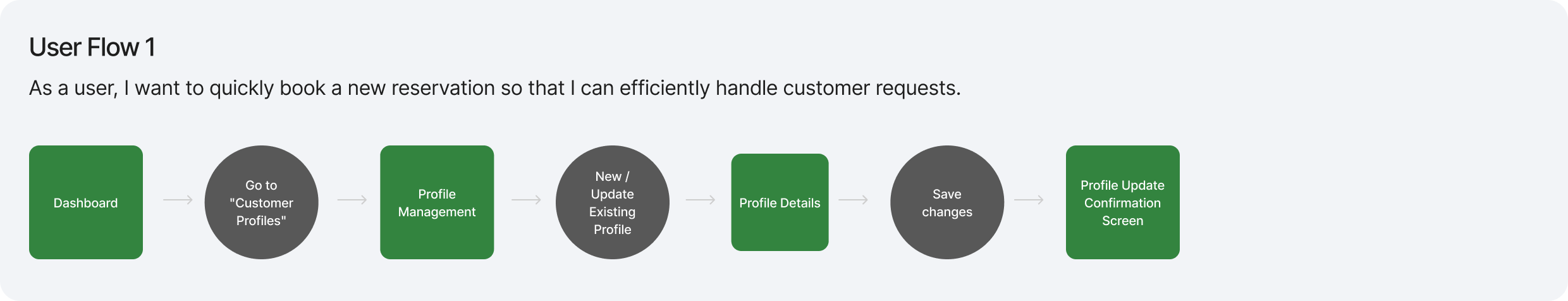
- Booking Reservations: As a user, I want to quickly book a new reservation so I can efficiently handle customer requests.
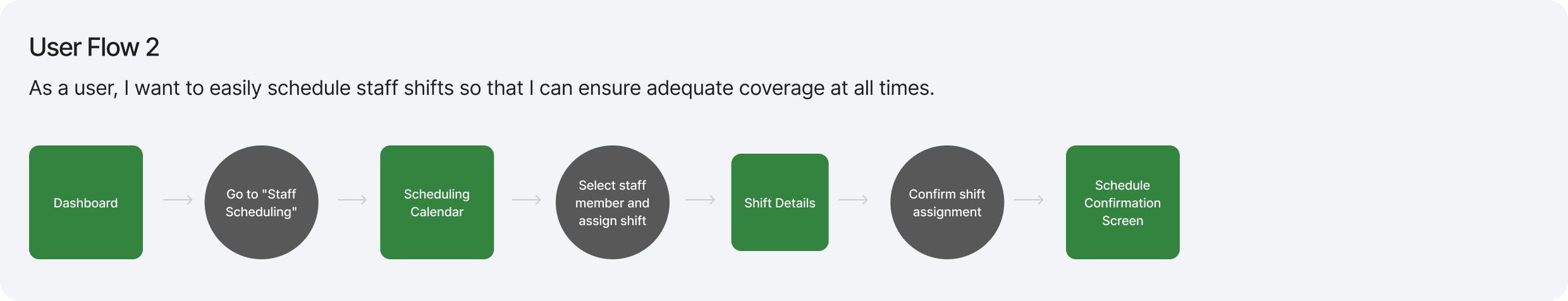
- Scheduling Staff: As a user, I want to easily schedule staff shifts to ensure adequate coverage at all times.
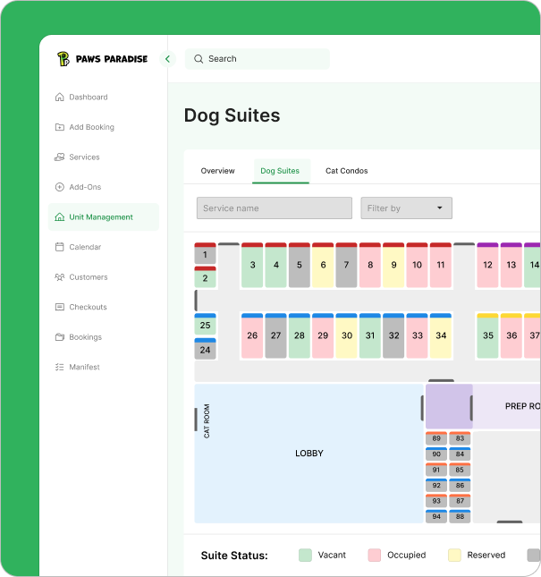
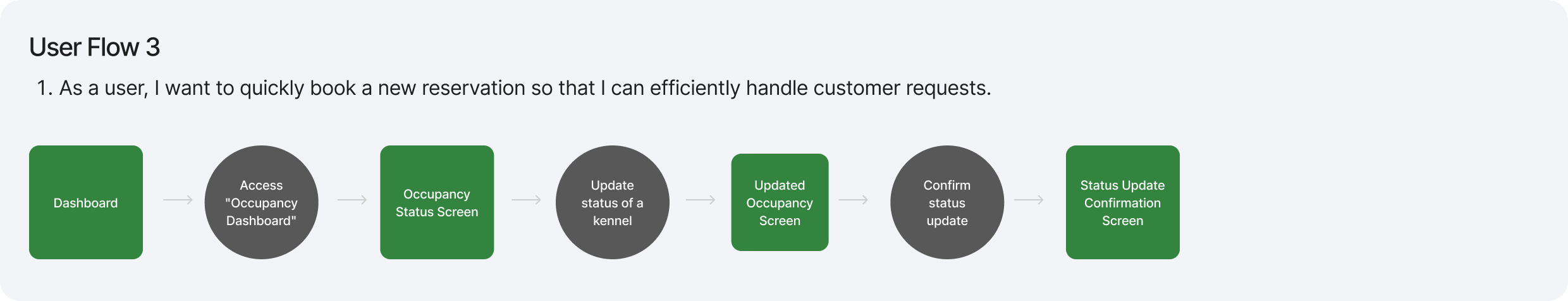
- Managing Occupancy: As a user, I want to view and update occupancy status to stay on top of available and occupied spaces.
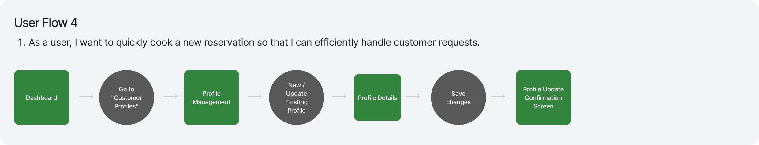
- Profile Management: As a user, I want to create and update customer and pet profiles to keep accurate records and deliver personalized service.
User Flow
I was actively involved in the creation of all four user flows, each designed to address specific red routes prioritized by the client. Among them, I led the development of User Flow 4, which focuses on streamlining the process of adding and updating customer and pet profiles. This flow empowers staff to efficiently manage essential details like pet information, emergency contacts, and special notes—enabling a more personalized experience. Each step was carefully designed to minimize friction and ensure a smooth, intuitive experience for front-desk staff and administrators.
Wireframes
In the initial round of medium-fidelity wireframes, our team decided to adopt the Material UI library in Figma. This decision was made to leverage the pre-built dashboard components, significantly simplifying our design process. While I primarily utilized the library, I also made necessary customizations to meet specific layout requirements, ensuring our design remained tailored to our project’s unique needs.
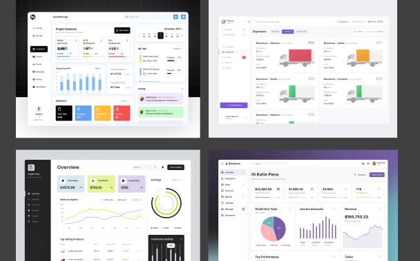
Moodboard
For the first round of medium-fidelity wireframes, our team adopted the Material UI library in Figma to accelerate the design process using pre-built dashboard components. I was responsible for implementing these components while customizing layouts where needed to better align with the specific requirements of the Paws Paradise Dashboard. This approach allowed us to maintain consistency while ensuring the design addressed the client’s unique functionality and user experience needs.
Style Guide
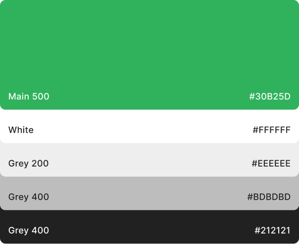
Building on the mood board I curated, I developed a functional and visually balanced color palette that incorporated the client’s existing primary green along with accent colors of orange and purple, supported by a versatile range of neutral tones. In response to the client’s request for a refreshed identity, I also designed a minimalistic logo using this palette—one that reflects the essence of the business and performs well across both digital and print applications. The client was very satisfied with the outcome.
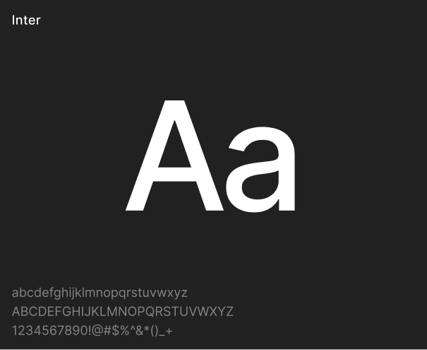
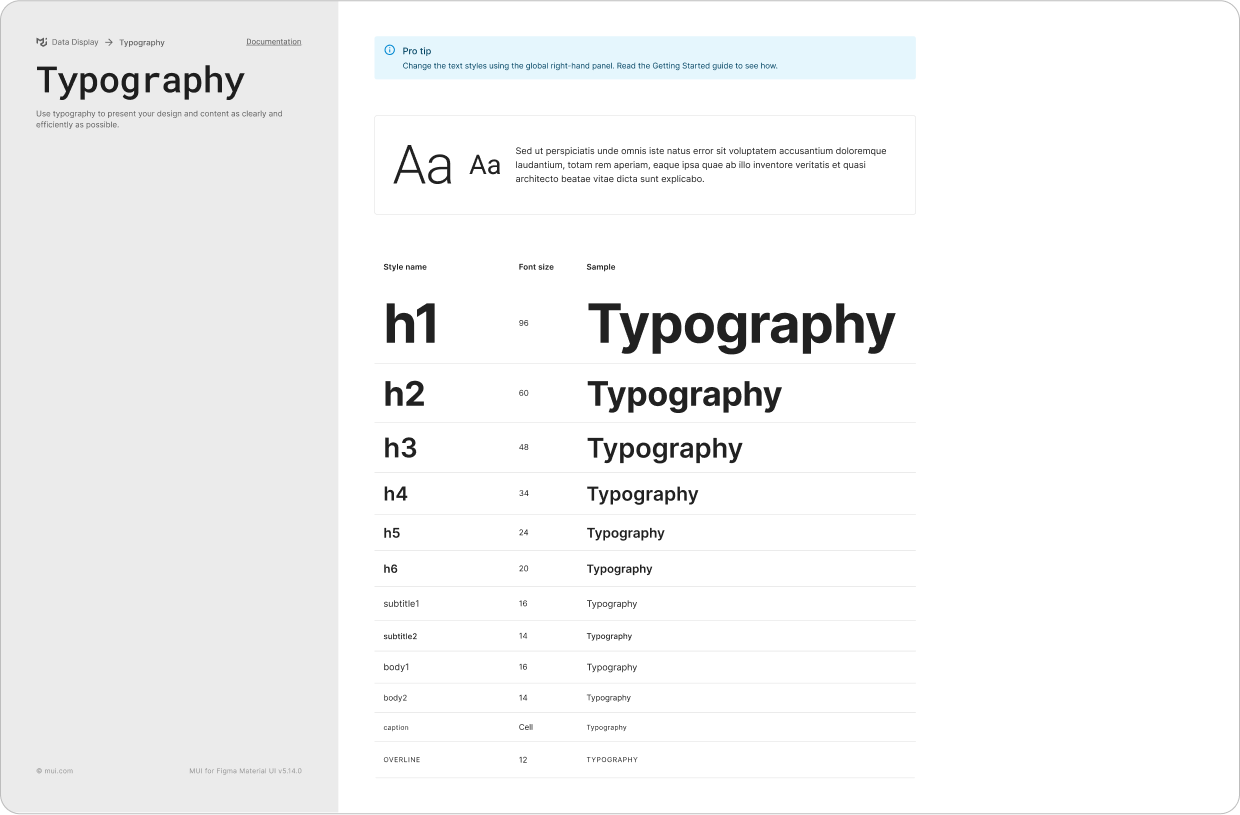
For typography, I selected Inter for its clean, modern lines and high legibility, reinforcing the platform’s calm and approachable tone. In the following weeks, I carefully refined the full style guide, covering key elements such as grid systems, iconography, illustration styles, component design, buttons, input fields, and navigation structures. This comprehensive guide ensured visual consistency and a cohesive user experience across the platform.
UI Iterations
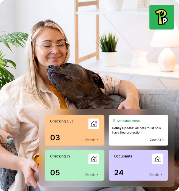
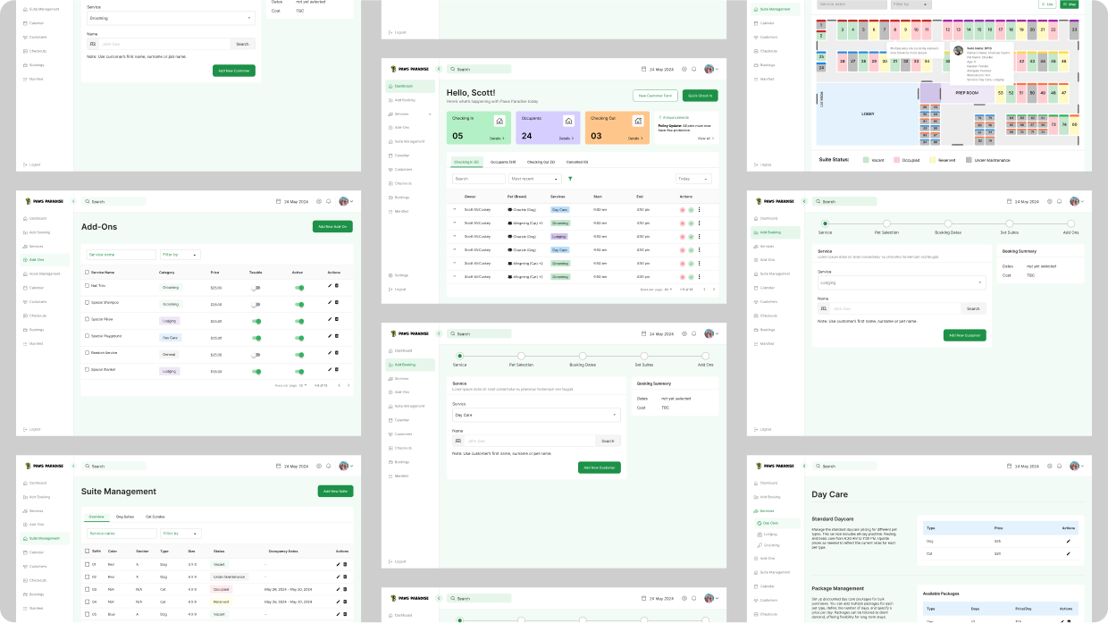
Using the finalized wireframes and style guide as a foundation, I began developing the high-fidelity UI designs. My focus was on enhancing usability and visual appeal by integrating rounded corners, ample white space, and clear visual hierarchy. These choices helped ensure that each component felt approachable, functional, and uncluttered.
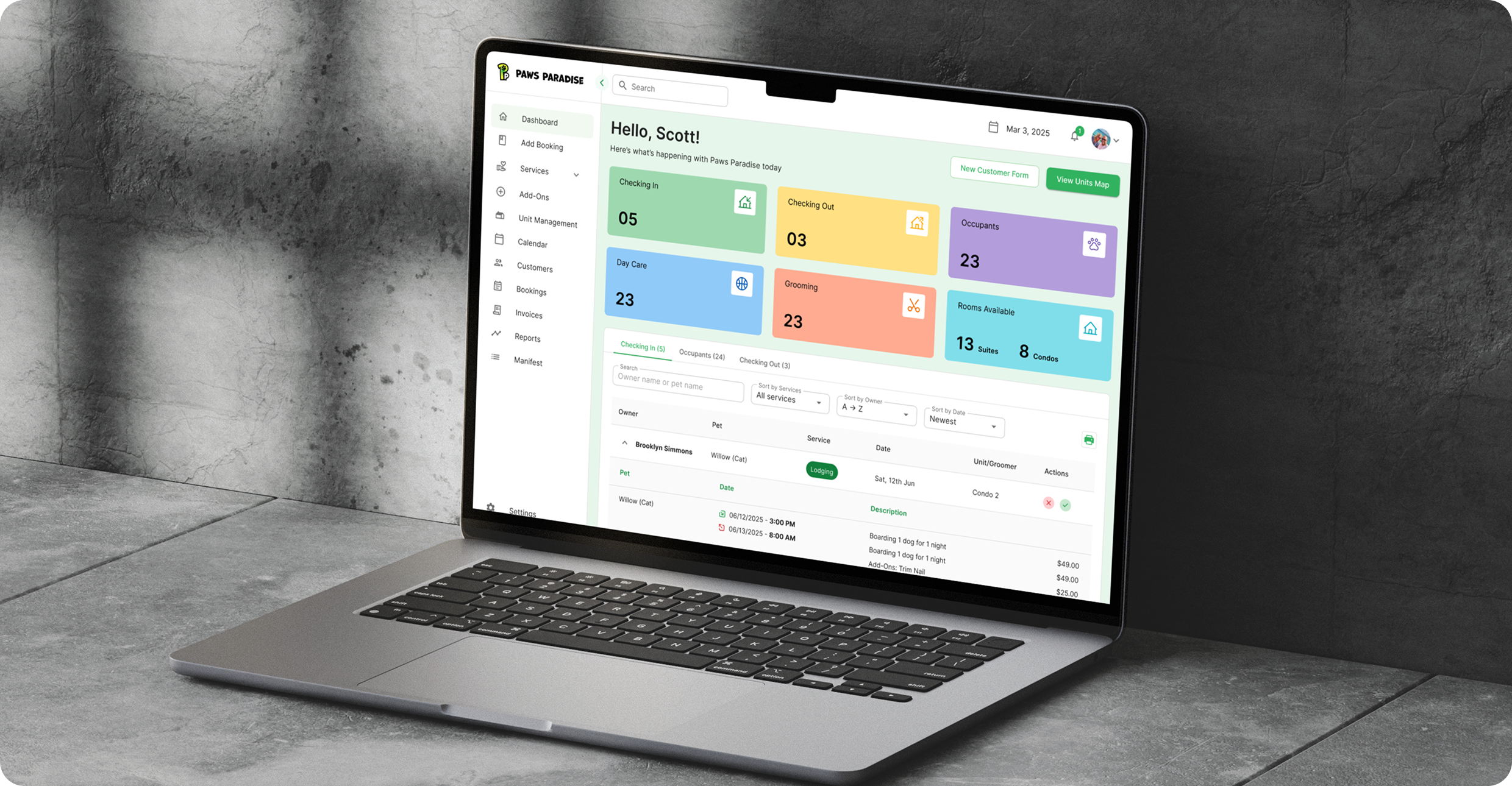
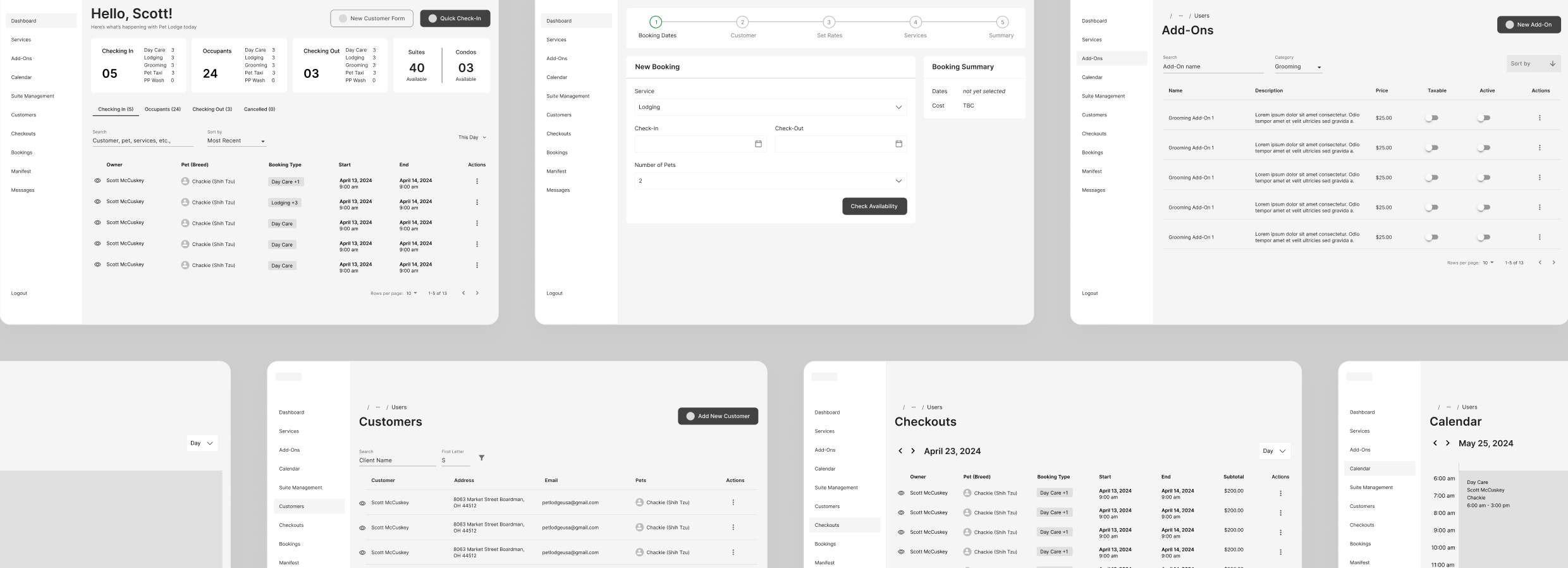
High Fidelity Screens
After incorporating the client’s feedback from earlier design stages, I refined the final high-fidelity screens with attention to detail and consistency. I leveraged Figma’s auto layout to ensure responsiveness and made sure that spacing, typography, and components were uniform and pixel-perfect across all views.
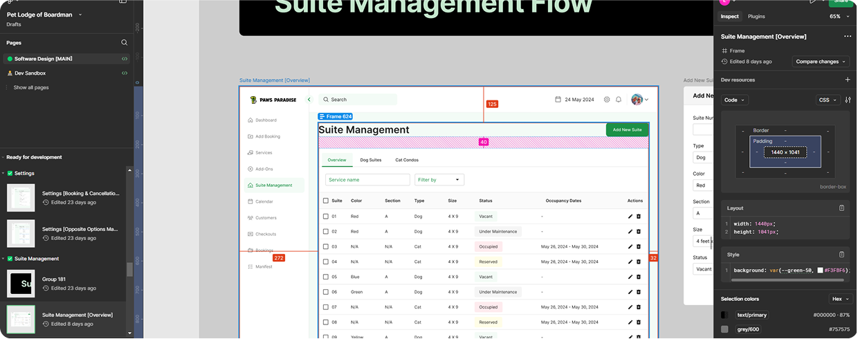
Annotations
Because our team was small and closely collaborative, developers were involved from the earliest stages—brainstorming through design—making a formal handoff unnecessary. This early alignment reduced the need for lengthy explanations and allowed for a smoother transition into development.
To support the process, I meticulously organized our Figma file with clear labels, detailed notes from our discussions, and grouped components for easy navigation. Leveraging Figma’s developer mode and pre-built components from the Material UI library helped streamline development and ensure consistent implementation across the interface.
Reflection
Working as part of a small, collaborative team provided me with valuable takeaways that will shape how I approach future design projects. Key lessons include:
- Prepare Essential Components Early: Identifying and designing commonly used components at the beginning of the project helped streamline the workflow and reduce redundancy during iterations.
- Ask the Right Questions: Gathering detailed client requirements before starting the design process proved essential. This ensured clarity on goals and functionality, minimizing the risk of overlooking key features.
- Never Stop Learning: Staying current with design trends, tools, and best practices is crucial. This project challenged me to expand my creative thinking and continue evolving as a designer.
Overall, this experience sharpened not only my technical skills but also reinforced the importance of intentional planning, clear communication, and growth-oriented reflection. I’m looking forward to applying these insights to future projects and continuing to push creative boundaries.