

Case Study: TrackTok
Mobile App
TrackTok is a mobile productivity app designed to turn daily goals into dopamine hits. Developed during a fast-paced design sprint, the app focuses on combating routine fatigue and poor time management with bold design, dynamic user flows, and a touch of personality. Despite being a hypothetical product, the sprint was executed with a real-world mindset, incorporating brand guidance from TikTok to ensure a relatable, high-impact outcome.
Client Research
Although our design sprint was based on a hypothetical project, we approached it with a real-world mindset. Our “client” was represented by three AI-generated personas, each facing different life situations but sharing a common struggle: burnout, repetition, and poor time management. We created and visualized these personas using Miro to help map behaviours, frustrations, and goals in an interactive way.
To better understand our users, we validated these personas by researching behavioural trends, lifestyle challenges, and common frustrations seen across productivity and wellness tools. We studied competitors like Headspace, Notion, and Pinterest, identifying how they handled task management, mental clarity, and creative stimulation. These insights guided our vision to create a product that would blend structure with flexibility, and utility with personality.
Heuristic Evaluation
We began by evaluating existing productivity and wellness apps from a first-time user’s perspective. Our findings highlighted a few key issues:
- Overwhelming UX: Users were often bombarded with complex onboarding or too many features at once.
- Repetitive Interaction Loops: Common task manager tools lacked emotional engagement, making them feel like chores.
- Inconsistent Visuals or Poor Personalization: Many tools didn’t adapt to users’ changing needs or moods.
This analysis informed our design direction. We focused on building a fun yet meaningful interface that supports users without adding pressure.
User Stories
To guide our solution, we focused on four red-route user stories:
- As a user, I want to track my goals easily so I can stay motivated and focused.
- As a user, I want to organize my tasks and events so I can better manage my time.
- As a user, I want personalized suggestions and support so I don’t feel overwhelmed.
- As a user, I want to monitor my spending and savings so I can manage my finances better.
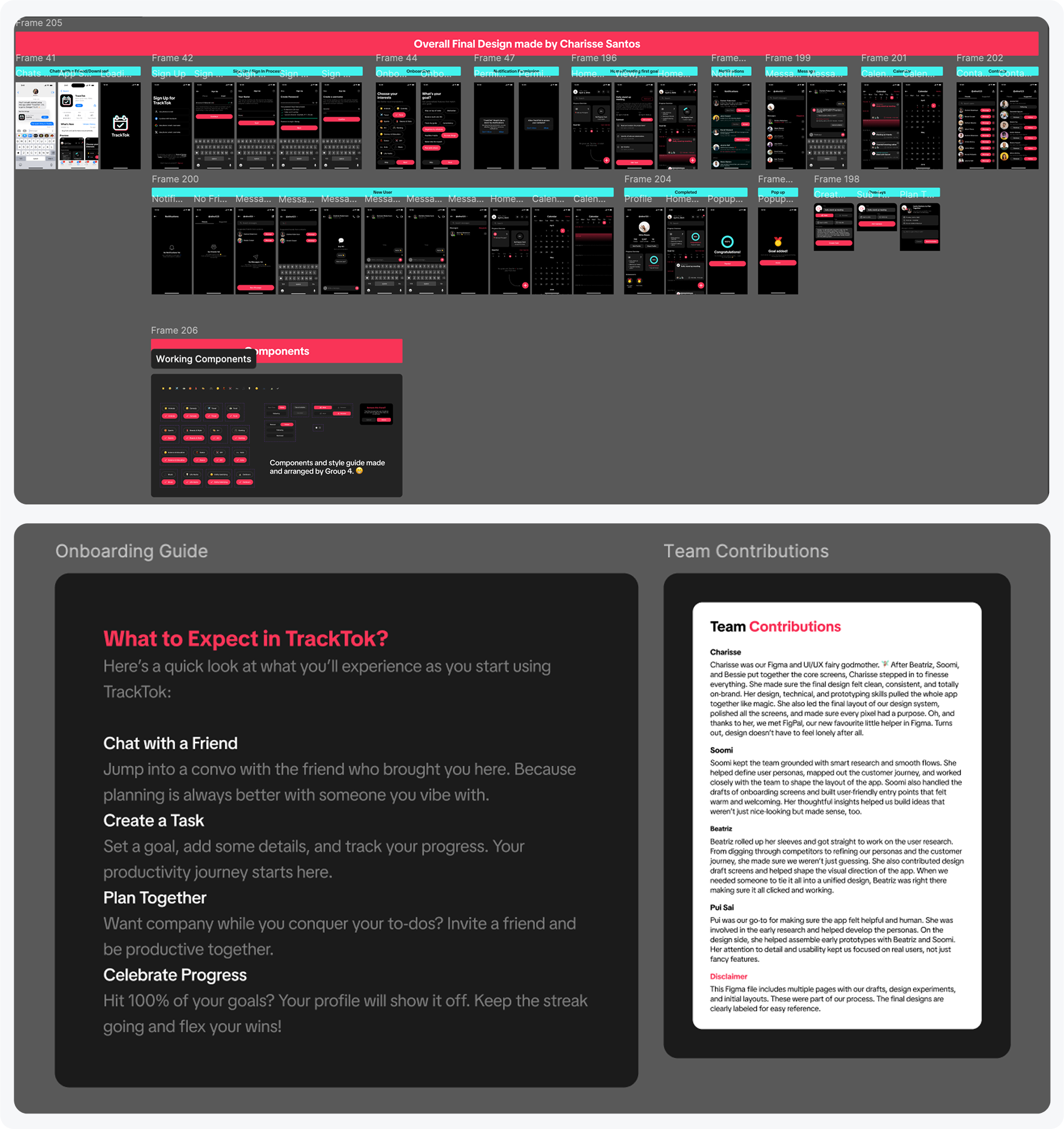
Onboarding Guide
- Chat with a Friend: Jump into a convo with the friend who brought you here. Because planning is always better with someone you vibe with.
- Create a Task: Set a goal, add some details, and track your progress. Your productivity journey starts here.
- Plan Together: Want company while you conquer your to-dos? Invite a friend and be productive together.
- Celebrate Progress: Hit 100% of your goals? Your profile will show it off. Keep the streak going and flex your wins!
User Flow
To support our main user stories, I led the creation of four essential flows that reflected each major function in the app. These flows ensured seamless interactions:
- Goal Tracker: Add, update, and check off progress on tasks.
- Calendar: Schedule events and to-dos with ease.
- Message Hub: Chat-style interface for personalized suggestions and encouragement.
- Event Tracker: Set reminders and track milestones tied to goal progress.
Each flow was designed with frictionless navigation, leveraging user feedback, and tested with simple task completion paths.
Mood Board
To visually reflect our product tone—motivating, bold, and playful—we created a mood board rooted in TikTok’s brand identity. High contrast, micro-interactions, and dark UI elements grounded the design. Pops of red, pink, and purple added vibrancy.
Wireframes
The Decide Sprint definitely got my adrenaline going. We had just 8 minutes to sketch up to 8 prototype screens, and while I thought that would be plenty, I quickly realized I had more to show. I ended up sketching 2 extra screens within the time limit, which surprised even me. 🥳 I focused on key features like the homepage, Goal Tracker, Calendar, and Financial Tracker, which all connect to the needs of our personas and their daily routines.
After the sprint, our team decided to start with the onboarding experience to make the app feel personalized right from the beginning. The screens I sketched helped us visualize how the app could flow and served as a strong foundation for the prototype. Even though they were rough, they gave us a clear direction and helped guide our next steps as a team.
I hand-drew the initial wireframes to sketch out interaction flows quickly and intuitively. These low-fidelity wireframes laid the groundwork for our app structure, enabling us to test layout concepts before digitizing them.
Each screen represented a core task — goal setting, financial input, habit tracking, and calendar events — and helped our team visualize user behavior and screen hierarchy. Despite the tight timeline, the wireframes played a vital role in setting direction and aligning the team.
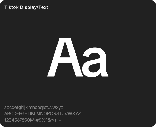
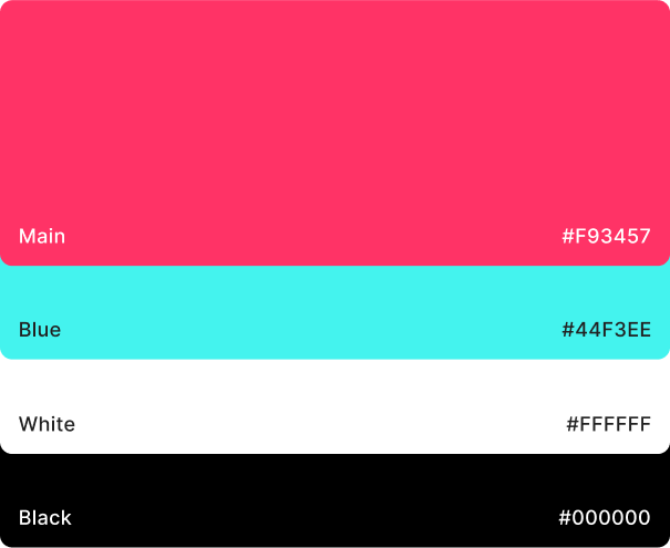
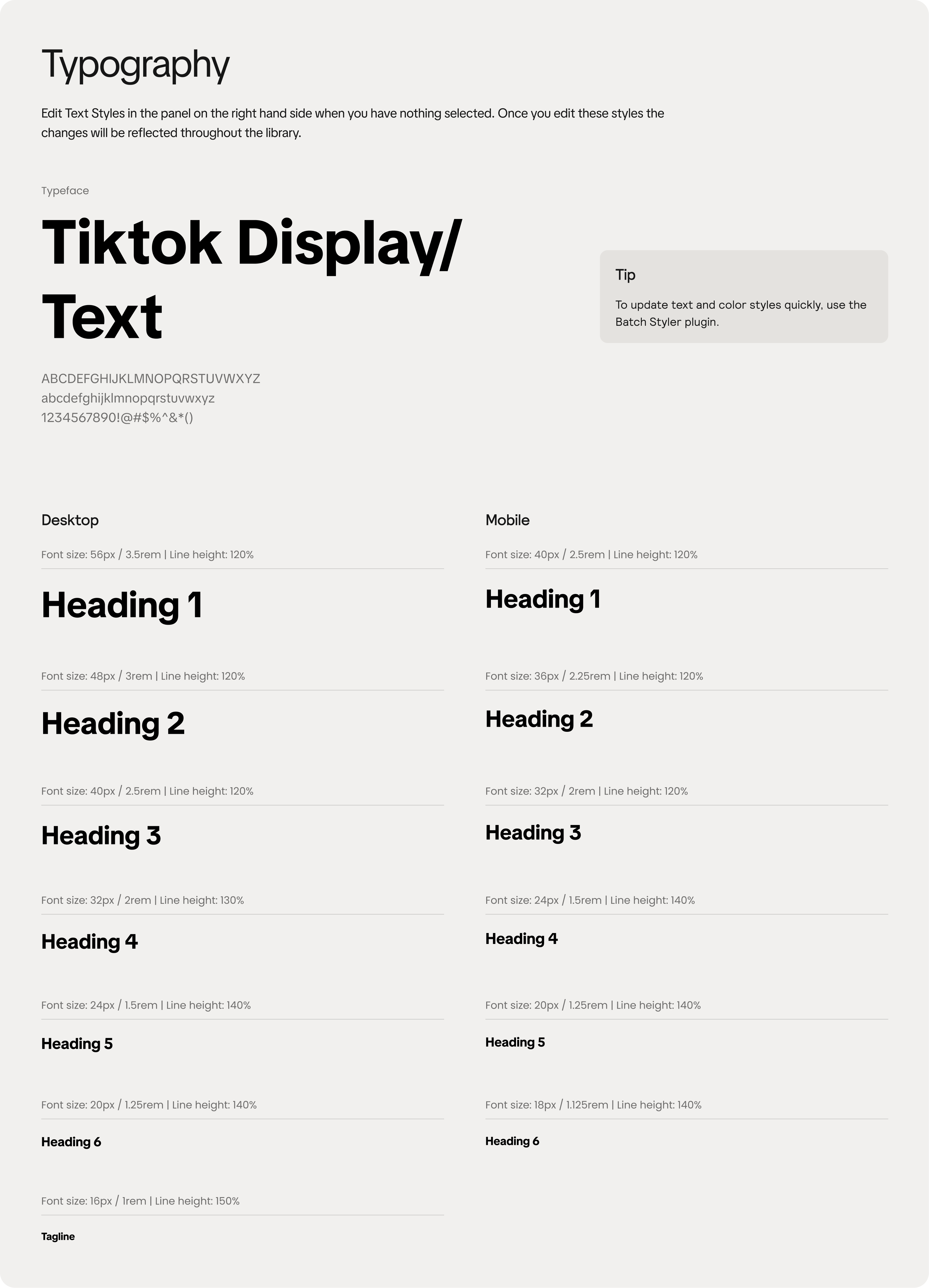
Style Guide
Inspired by TikTok's design guidelines (as recommended by our instructor), I built a cohesive style guide that included:
- Color Palette: Primary black, red, and accent purple + green
- Typography: Inter font for its modern, clean look
- Buttons & Icons: Rounded, accessible, and labeled clearly
- Spacing & Layout: Consistent grid with breathing room for every element
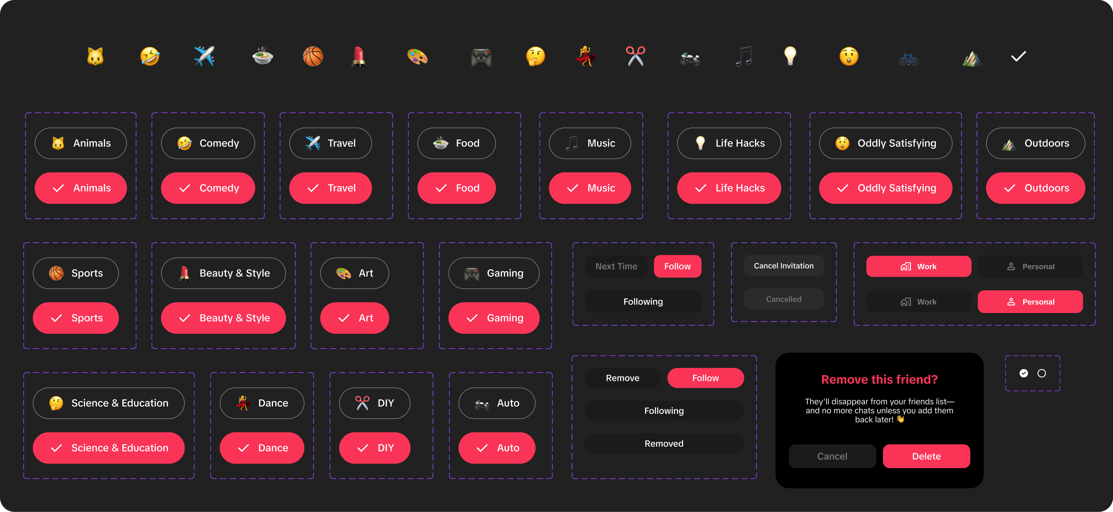
Working Components
To streamline development and ensure consistency, I created a robust component library. These working components included:
- Interest Tags with emoji icons, allowing users to customize onboarding.
- Follow/Unfollow Buttons with different states (e.g., next time, cancel invitation).
- Task Type Filters for “Work” and “Personal” views.
- Warning Dialogs like “Remove Friend” confirmation modals.
Each component followed our style guide, prioritized accessibility, and was tested in Figma’s prototype mode for usability. This system allowed our team to iterate rapidly and maintain consistency across screens.
UI Iterations
Starting with medium-fidelity designs, I refined the look of each component based on feedback. Rounded corners, balance of text and visuals, and microfeedback cues (like hover states) were all incorporated. Reusable components and auto layout were used extensively for consistency.
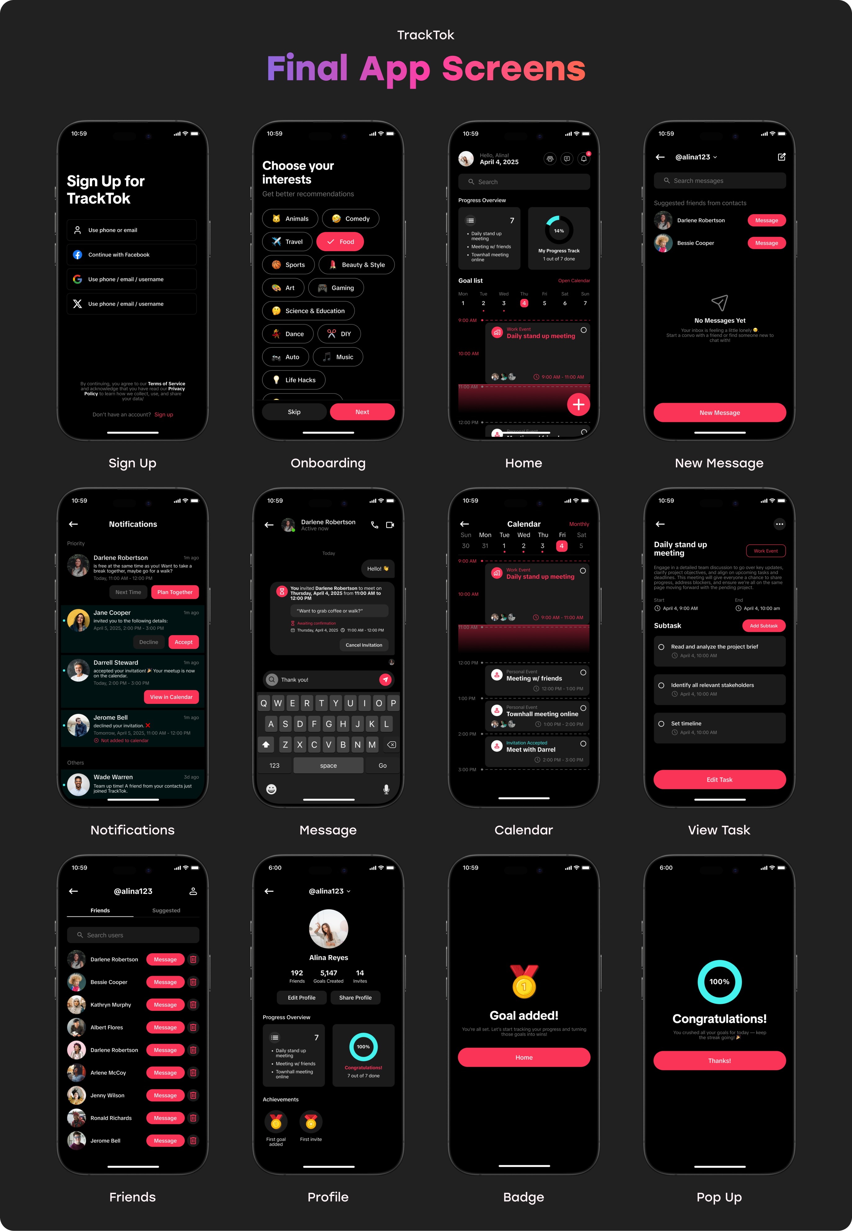
High Fidelity Screens
I led the final visual execution in Figma, designing over a dozen polished screens including:
- Sign Up / Onboarding
- Dashboard & Calendar
- Goal Tracker
- Message Hub
- Financial Overview
- Achievement Pop-Ups & Progress Charts
These visuals not only conveyed functionality but also boosted emotional engagement through color, layout, and interaction.
Annotations
Since our team was small and highly collaborative, formal handoff wasn’t needed. Instead, I ensured our Figma files were cleanly organized with component labels, developer notes, and screen-by-screen logic. I also recorded Loom walkthroughs for asynchronous clarity.
Reflection
Leading TrackTok’s design sprint taught me the power of adaptability and empathy. Our AI personas were a springboard, but the real impact came from constant iteration, open feedback, and anchoring our design decisions in human motivation.
Key takeaways:
- Design systems save time when you build early.
- Clear roles + team trust leads to smoother outcomes.
- A joyful interface is just as important as functionality.
TrackTok may have been fictional, but the process was deeply real—and a strong reminder that great design meets users where they are, then gently moves them forward.